35 Proven Donation Page Strategies to Maximize Giving
Picture this: your nonprofit is launching a fundraising campaign to bring in support for a new community program. You promote your campaign on social media, create an engaging donation page that gives an overview of its purpose, and widely share the link to your donor base.
However, when the countdown clock runs out, you find that you didn’t even come close to reaching your fundraising goal. What happened?
The key to any successful online fundraising campaign is providing a user-friendly and engaging donation experience for your donors. Donors report that their top motivators for giving are connection to your mission, trust in your organization, and overall ease of donating, and if your donation page isn’t checking off all these boxes, it’s likely time for a revamp.
In this guide, we’ll cover the top strategies for creating a donation page that maximizes giving, organized into the following categories:
- Technical Considerations
- Inspiring Design
- Trustworthy Content
- Accessibility
- Flexibility
- Marketing
- Engagement Opportunities
The quality of your donation page can make or break your fundraising strategy. Armed with the right strategies and tools, you’ll be in great shape to boost your donor conversion rate and build a sustainable donation pipeline. Let’s jump in!
Technical Considerations for Your Donation Page
While the visual appearance of your donation page will play a strong role in whether donors decide to give, it’s also critical to consider how easy it is for your supporters to submit a gift. Use these tips to create a strong technical design that smoothly moves supporters through the donation process.
1. Leverage the right donation page software.
Your donation page must encompass several characteristics to bring in necessary donations: It needs to be simplistic to make the giving experience seamless, but also offer a variety of options so that donors can customize their gifts. It should be minimalistic to reduce any distractions, but also visually appealing enough to compel visitors to donate.
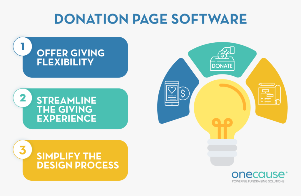
To ensure your donation page includes everything it needs and save your team time, leverage comprehensive donation page software. The right tool will help you:
- Offer giving flexibility: Your fundraising solution should make it easy to offer donation customizations, including the ability to configure giving levels and frequencies.
- Streamline the giving experience: Capture more donations with mobile-friendly forms, allowing donors to give quickly and easily from any device.
- Simplify the design process: Make your giving page 100% authentic to your organization’s brand and capture donors’ attention with easy-to-use design tools.
If you’re ready to upgrade your online fundraising solution, make sure your new platform has a full suite of features to ease your team’s administrative burden and support all types of fundraising. An all-in-one fundraising platform like OneCause has everything you need to make fundraising seamless and flexible, empowering you to develop high-converting donation forms for any campaign or event and meet (and exceed!) your goals.
2. Feature your donation page on your website.
Your nonprofit’s website is the headquarters for your digital presence. While prospective supporters may first discover your nonprofit through your social media presence or a fundraising flyer, they’ll most likely end up on your website in hopes of learning more about your mission, fundraisers, volunteer opportunities, and more.
Instead of sending supporters to a third-party website to donate, embed your donation page directly into your website. This simplifies the donation process and helps donors feel confident that their funds are going to your organization.
Feature your donation page prominently on your website to promote and facilitate giving. For instance, you might create a bold “Donate Now” button in your navigation bar, ensuring that visitors arriving on your website with the intention to give can locate your donation page with ease.
3. Integrate your donation page with your fundraising software.
By pairing your donation page with your nonprofit’s fundraising software, you’ll be able to track important donation data, including:
- Individual donor behaviors, like donation frequency
- Average donation size
- Contact information
An all-in-one solution will sync all incoming data from your donation pages to your fundraising platform, ensuring you always have a 360-degree view of how your fundraising campaigns are performing and can make data-informed decisions to hone your fundraising strategy.
4. Leverage A/B testing to find the most effective design.
Donation page performance is key to ensuring visitors go through with making a gift. A/B testing helps you identify the best design by comparing two versions of your page.
In this experiment, visitors will either see the first version of your donation page or the second version. You’ll analyze their engagement and determine which version was more effective. Then, you can adjust the page as needed to capture the most donations based on the insights gathered from your test.
Make sure to only adjust one feature, like the header image, between your two versions so you know exactly what quality of your donation form is driving more conversions.
5. Make your donation form mobile-optimized.
Over half of all nonprofit website traffic and 33% of online donations come from mobile devices. But mobile users won’t stay on your donation page for long if the form is difficult to use.
To make your form mobile-friendly, consider the following tips:
- Enhance your loading page speed. Ensure your page loads quickly and correctly on mobile devices by compressing files and optimizing images. Use free tools like Google Lighthouse to test your current donation page loading speed.
- Use clickable buttons and prompts. Instead of requiring donors to type each field response, offer buttons and prompts that can be tapped where possible so they can select their responses with ease.
- Include field labels. Since mobile screens are smaller than desktop displays, donors will likely have to scroll to complete your form. Include field labels to help them keep track of the information requested.
Ensure the page’s overall design is responsive, meaning text and images should resize according to the dimensions of the mobile device. Then, test it out yourself to ensure your form is easily accessible from a mobile device!
Creating a Donation Page that Inspires Giving
To convert page visitors into donors, your donation page must make a compelling case for support. Use these tips to create an inspiring donation page that moves page visitors to take action.
6. Brand your donation page.
Donors often give because of their affinity for your nonprofit’s mission, meaning your brand is crucial to their decision to donate! Make it prominent on your donation page by including your nonprofit’s:
- Logo
- Color palette
- Tagline
- Fonts
Also, ensure your donation page matches your brand’s voice and tone. Adding your personal touch to your donation page will help to build trust with your supporters and make them confident that they’re giving to the right organization.
7. Leverage storytelling.
Remind donors of the reason their gift is so essential with a compelling story of your nonprofit’s work. For example, you might include a picture of a beneficiary your nonprofit recently aided. Explain how donations can help people like this individual gain access to fresh water, better education, or any other necessities your nonprofit aims to provide.
8. Include a strong call to action.
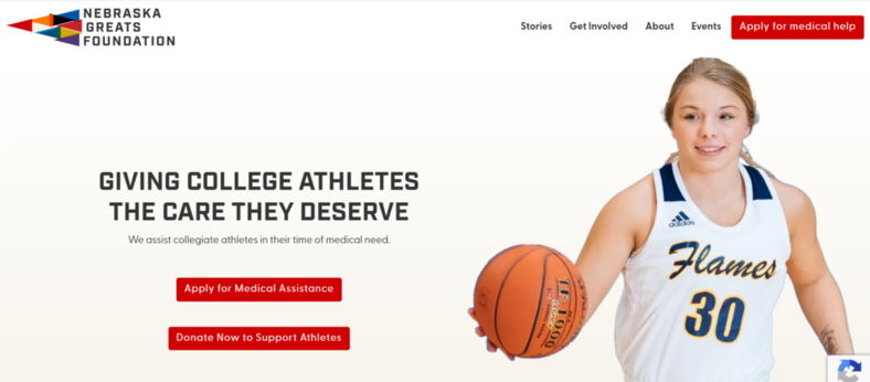
Urge users to complete the donation process with a strong call to action. Your call to action (CTA) should stand out from the rest of the page and create a sense of urgency. Consider this example from the Nebraska Greats Foundation:
In this example, two calls to action provide different actions that page visitors can take. The red buttons stand out from the rest of the page, immediately capturing donors’ attention. These calls to action are also contextualized with compelling visuals and text that explain the need for support.
9. Use high-impact visuals.
Visuals have the power to compel visitors to take action, which is why your donation page should include images and videos that drive support.
Showing volunteers in action or beneficiaries who were impacted can create a strong emotional connection with potential donors. These visuals make donation page visitors feel immersed in your nonprofit’s work and prompted to take action.
Plus, by illustrating the urgent need for donations, you can take the impact of your mission statement and appeal for support to a whole new level. An attention-grabbing visual will make your donation form hard to ignore, and visitors will be more likely to follow through and take action.
10. Avoid distractions.
The best way to inspire giving is to keep the focus on what really matters: donors’ ability to further your nonprofit’s work. To achieve this, your donation page should avoid any distractions that might take the attention away from donating, such as:
- Pop-ups: Don’t let elements, such as lightbox pop-ups, overshadow your donation form and appeal for support.
- GIFs: Reduce any unnecessary movement on your donation page by excluding GIFs.
- Extraneous form fields: Avoid making your donation form too long with unnecessary donation prompts. Stick to asking only for the essentials, including your donors’ contact information, donation amount, and billing information.
A simple donation page will help donors stay focused on giving, allowing them to easily submit a gift in just a few moments!
Making Your Donation Form Trustworthy
For donors to follow through with their gifts, they must trust that your organization safely processes payments and uses them for its charitable mission. Create a trustworthy donation form with the following tips.
11. Provide a brief, compelling description of your mission and work.
Donors should feel confident that your donation page belongs to your nonprofit, and you can instill this confidence by including mentions of your mission and work. Linking the donation process to your purpose also helps to explain how donors’ gifts will translate into tangible change in the community.
With 61% of donors reporting that they last donated to a social fundraising campaign because they “cared about the mission,” it’s critical that your purpose is connected to every step of the donation process.
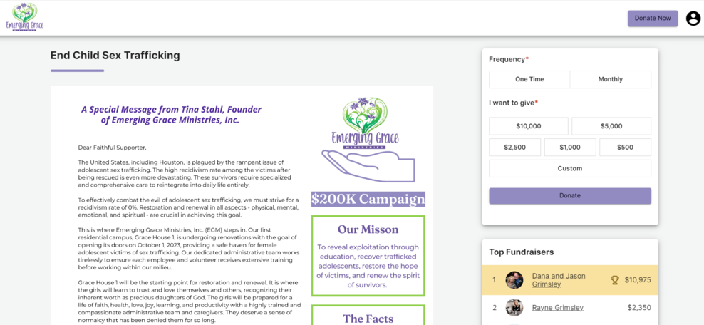
Consider how Emerging Grace Ministries roots its donation page in its mission:
In this example, Emerging Grace Ministries reiterates its mission to “reveal exploitation through education, recover trafficked adolescents, restore the hope of the victims, and renew the spirit of survivors.” Not only does this provide consistency between the nonprofit’s brand and donation page, but it further compels visitors to give by reminding them of the nonprofit’s important work.
12. Use a PCI-compliant payment processor.
A PCI-compliant payment processor follows the standards set by the PCI industry, including firewalls, encryption, and other security measures to keep donors’ payment information safe. Add a brief note about PCI compliance next to the payment information section of your donation page to assure donors their sensitive information will be protected.
13. Show the impact of suggested gift amounts.
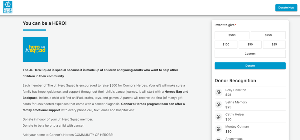
To show donors how you’ll use their gifts to benefit your mission, list out the specific ways certain donation amounts will make a difference. Consider this example from JR Hero Squad:
By calling out what beneficiaries will receive with a specific giving amount, JR Hero Squad takes the guesswork out of giving and prompts donors to potentially give more than they originally intended. Suggested donation amounts also create a high level of transparency, allowing you to communicate trust and build strong relationships with supporters.
14. Display third-party trust badges or certifications.
Illustrate the trustworthiness of your donation page with small visuals that represent your nonprofit’s credibility. For example, you might list:
- Accepted payment badges: Mastercard and Visa logos, for example, are among the most recognizable trust badges. Displaying these on your donation page can make donors confident that your nonprofit offers credible payment options.
- Supporter logos: If your nonprofit is supported by a well-known corporation, include their logo on your donation page to show donors that a trustworthy business supports your cause!
- SSL certification badge: Include an SSL certificate badge to show donors that your checkout page is secure.
Also, a note about your nonprofit’s 501(c)(3) status can bolster donors’ trust that your organization is checked by the IRS for proper use of its funds to serve a charitable purpose. It can also be a great place to remind them that their donations are tax deductible!
15. Let donors know how you’ll use their information.
Be upfront about why your donation page asks for donors’ information and how you’ll use it. For example, explain that donors who provide their phone numbers will be opted into your nonprofit’s text messaging campaign. This shows that your nonprofit is being completely transparent.
Embedding Accessibility into the Donation Experience
Your donation page should be meaningful and usable for as many donors as possible. Make it accessible to all using the following tips.
16. Limit the number of prompts.
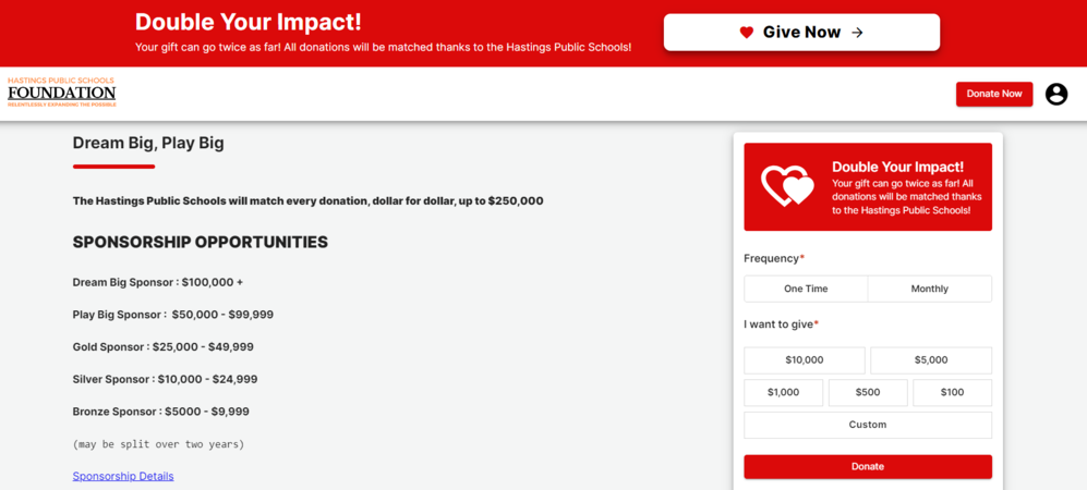
Whether accessing your donation page on a mobile device or computer, donors will quickly become disinterested if they’re required to answer too many prompts. Keep your donation experience simple, like the following example from the Hastings Public School Foundation:
Hastings Public School Foundation cuts down the time it takes to submit a donation with a brief form that simply asks for the frequency and size of the gift. These prompts can be answered with tappable buttons, but also offer customization for donors to choose a different response.
17. Use ample white space.
A cluttered donation page can feel overwhelming, which is why you should use ample white space to give it a clear appearance. This makes it easy to read, especially on mobile devices. Just be sure to balance your white space with the appropriate use of visuals so your page doesn’t look too bland.
18. Incorporate a high color contrast.
Sufficient color contrast is not just an accessibility requirement, but also essential for drawing attention to the most important elements of your donation page. CubaCaribe’s donation page offers a great example of this:
On this page, CubaCaribe’s use of teal blue against a white background highlights the donation form’s most important elements, like its donation button. Web accessibility guidelines require a contrast ratio of at least 4.5:1 for text and images of text. To test the contrast ratio of your donation page, use an online contrast checker.
19. Include alternative text for visuals.
Alternative text, also called alt text, explains what a visual is showing for users leveraging screen reader software to access your donation page. To make it accessible for every visitor, include descriptive alt text for each visual element on your page.
20. Make your donation page easy to find.
Point website visitors to your donation page with streamlined navigation. Include a “Donate” button on your website’s navigation menu so that users can find the page no matter where they are on your nonprofit’s website.
You can also place CTAs throughout your website that take users to the donation page. That way, visitors are urged to take action after learning more about the background of your organization or reading about your different programs.
Making Your Donation Page Flexible
Along with accessibility, there are some actions you can take to offer flexible options for donors as they submit gifts. Use the following tips to make a flexible donation page.
21. Offer one-time and recurring donation options.
While your donation page should streamline the donation experience, a lack of options can limit donors’ giving. Recurring donors give 42% more per year than one-time donors, meaning that you can bring in a lot more donations by making it easy to sign up for recurring giving.
Offer recurring donation options along with the ability to make a one-time gift. This way, donors have the flexibility to give as frequently as they want.
22. Allow for payment flexibility.
Accepting a variety of payment options can ease giving for donors by allowing them to give to your cause using a payment method they’re used to. To capture the most donations possible, offer multiple options for making payments, such as Google Pay, Apple Pay, credit, debit, and ACH deposit.
23. Provide the ability to cover transaction fees.
To make the most of a donor’s gift, your nonprofit needs to be able to use the entire donation. However, some donors may not know that part of their gift will cover transaction fees, so the amount your nonprofit is able to use for its mission is lessened. Offer the option to cover transaction fees for donors who want to pay for this cost.
24. Enable donors to dedicate gifts in memory, honor, celebration, or tribute.
Provide an option for donors to dedicate meaningful gifts to loved ones through a simple checkbox at the bottom of your donation form.
Or, even better, allow your supporters to create their own donation page in honor of their loved one, and have them raise funds on your behalf! Personal Fundraising Pages are powerful fundraising tools that allow you to expand your reach and raise more for your cause. Don’t miss out on this often untapped opportunity!
25. Tap into matching gifts.
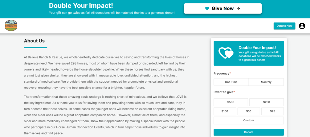
Encourage donors to maximize their gifts by checking their eligibility for matching gifts through their employers. Additionally, if your organization sets up its own matching gift campaign, be sure that it has a prominent feature on your donation page. Consider how Believe Ranch & Rescue makes matching gifts prominent on the page:
By embedding a matching gift tool into your donation page, donors can simply check their eligibility and automatically submit a matching gift request without leaving your website. Then, your nonprofit can double (or triple!) the gift size you would have otherwise received!
Promoting Your Donation Form Widely
To collect as many donations as possible, you’ll need to spread awareness of your donation page. Follow these strategies to widely promote your donation form and page.
26. Share links to social media.
Include a link to your donation page in your social media bios and grow your reach by adding social sharing buttons to your page. This way, supporters can share your donation page with their followers, increasing awareness around your organization and mission and helping you acquire more donors.
27. Spotlight giving opportunities in your email newsletter.
Promote your donation page to email newsletter subscribers. In this medium, you can offer more detailed information about the need for support and how donations will be used. That way, supporters will have all the context they need to compel them to give before even landing on your donation page.
28. Leverage Google Ad Grants to boost visibility.
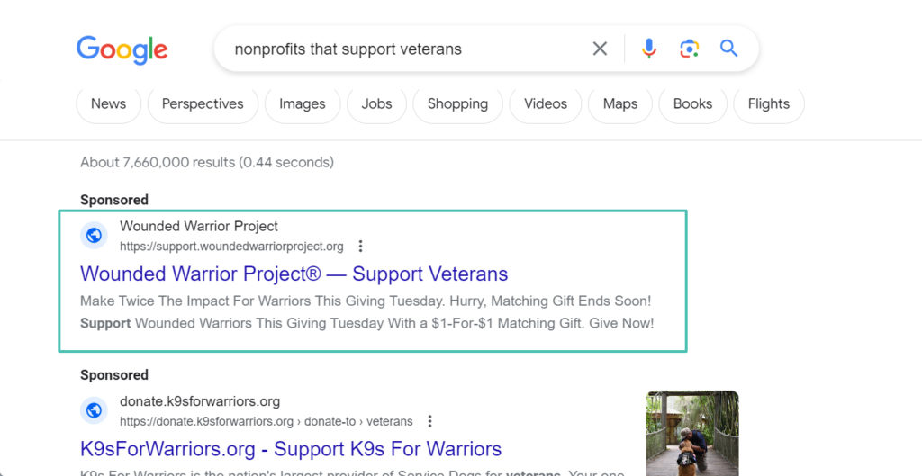
Boost the visibility of your donation page by applying for Google’s Ad Grant program, which awards eligible nonprofits $10,000 in monthly ad credits to use to promote their websites. By using the grant money wisely to target the right keywords, your donation page will show up at the top of the search engine results, allowing more internet users to find your website.
For example, the Wounded Warrior Project created an ad that targets the keyword, “nonprofits that support veterans.” So, when a search engine user searches for that keyword, the Wounded Warrior Project’s website will appear first.
29. Add a QR code to your direct mail.
Transform your physical communications into digital experiences by adding a QR code to your direct mail. This way, donors who receive direct mail from your nonprofit can directly access your donation page simply by scanning a QR code with the camera on their mobile device.
30. Discuss fundraising needs in your blog.
To fundraise online, you need to make a compelling appeal for support on all your channels of communication. Your website’s blog is the perfect place to get the word out about your cause because it allows you to use text, images, videos, and other elements to set the stage for your fundraising appeal. Link to your donation page on relevant blog posts to point readers to the answer to your fundraising needs.
Fostering Continuous Engagement with Your Donation Page
Donor engagement doesn’t stop after the donation is submitted. Use the following tips to continue engaging donors after they contribute through your donation page.
31. Create an engaging confirmation page.
Donor recognition is largely important to retain their support. Create a confirmation page to thank donors after they make a donation and assure them that their donation was received.
This is another good place to include social media sharing buttons. This allows donors to share that they just made a donation with friends and family and encourage others to get involved.
32. Provide links to other involvement opportunities.
While the word “donation” carries a financial connotation, your nonprofit needs various mediums of support to fulfill its mission. Include links to other involvement opportunities on your donation page, such as:
- Advocacy
- Volunteerism
- Peer-to-peer fundraising pages
- DIY campaigns
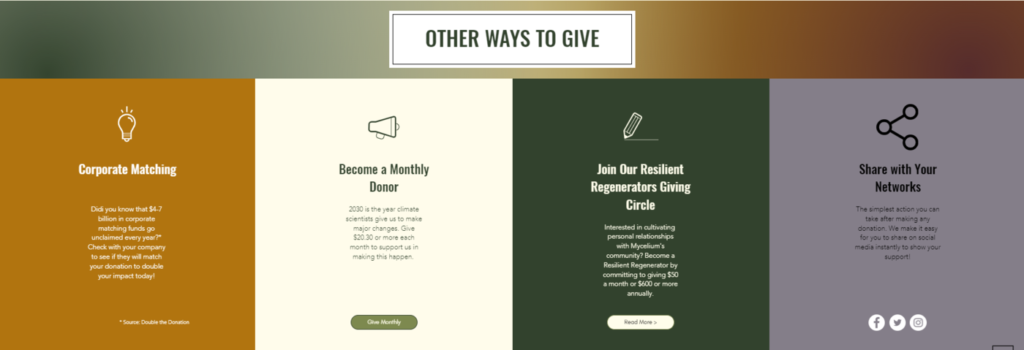
Consider this example from the Mycelium Youth Network:
In this example, Mycelium Youth Network encourages donors to continue their involvement through corporate matching, recurring giving, and social media sharing. This way, donors can opt to switch up their gifts or continue giving after making a donation.
33. Ask for volunteer interest as part of the donation form.
Consider asking about a donor’s interest in volunteer opportunities so you can engage supporters more effectively and continue their involvement beyond your donation page. You might make this field optional on your form, but posing the question may identify donors who would like to play a bigger role in your mission. Then, you can follow up with them about volunteer opportunities.
34. Show real-time progress.
Imagine this: you visit a nonprofit’s donation page and see a fundraising thermometer that shows the organization is just $20 away from its goal. When donors know their gift may push your nonprofit past its fundraising finish line, they’ll be more inclined to give. Add a fundraising thermometer or other visual to represent fundraising progress for your campaigns.
35. Follow up as part of your donor stewardship strategy.
To effectively steward donors and encourage them to continue their support, follow up after each donation. Express your genuine gratitude by including:
- A personalized message
- A reference to the specific amount given
- The impact of the donor’s gift
Be sure to link to other communication channels in your follow-up, such as social media accounts. This way, donors will know how to stay connected with your organization after their gift is complete.
Wrapping Up
Your nonprofit’s donation page is a crucial part of garnering support for your cause. Use these strategies to create a strong page and regularly refresh it as needed to drive more conversions. The right technology can streamline the process and take the administrative burden off your team.
For more information on maximizing support for your nonprofit, check out the following resources:
- 25 Essential Nonprofit Software Solutions for Your Toolkit: Ready to upgrade your fundraising plan with intuitive software? Explore our roundup of the top nonprofit software solutions here.
- Creating a Standout Awareness Campaign: A Complete Guide: Looking to raise more revenue for your mission and boost awareness? An awareness campaign can educate potential supporters about your nonprofit’s mission and result in more support for your cause! Learn how to start an awareness campaign in this guide.
- Top Online Fundraising Ideas to Capture Donors’ Attention: Need an eye-catching fundraising idea to engage donors? Check out our list of top online fundraisers plus tips and tricks to make your next one a success!

